MAMA GLOW FOUNDATION
Advancing reproductive justice through education, advocacy & the arts.
CONTEXT
The Client
Named one of Oprah Winfrey’s Super Soul 100, Latham Thomas is the founder of the Mama Glow Foundation, a global maternal health and education non-profit on a mission to transform the landscape of reproductive health in the U.S. by educating and empowering communities. The Mama Glow Foundation seeks to improve the experience of maternal health for birthing people everywhere with focus on education, advocacy, and the arts.
The Ask
The Mama Glow Foundation website launch was the foundation’s introduction to the world. The website needed to immediately communicate the foundation’s mission, work, and impact in order to inspire trust in potential corporate partners and individual donors. Making a donation needed to be as minimal and seamless as possible.
Duration: 2 months
The Result
A 9-page foundation website with over 19K page views where visitors can learn about the foundation and make donations. The website as calling card allowed the foundation to develop partnerships with companies like Carol’s Daughter (a L’Oreal Company), Goldman Sachs, Kate Spade, and Spotify, amongst others.
My Role
I led the kickoff, discovery, ideation, and delivery of the website as lead UX Designer in collaboration with the Mama Glow branding team.
DISCOVERY
The discovery phase included stakeholder interviews to identify potential donors, a competitive analysis to identify key industry trends, and subject matter expert interviews to discuss donation strategy.
The primary takeaway is that potential corporate sponsors and donors want to know if the organization is in line with their ideals and values. In order to make a decision, potential donors want to see the organization’s mission, goals, and objectives quickly and effortlessly. Optimally, they would like to see how the organization uses donations and contributions.
DEFINE
Personas
When I met with stakeholders, we defined three types of potential users based on their experience with their existing Mama Glow community and visitors to mamaglow.com.
Individual Donor
Name: Sophia Moore
Gender: Female
Age: 40
Location: Los Angeles
Work: Marketing
Persona Bio
Sophia joins Gwyneth Paltrow’s instagram live with Latham Thomas where they are discussing black maternal health and the BLM movement. Sophia has been looking for ways to become involved so she clicks to Latham’s instagram account to find a way to make a donation.
Goals
Support black maternal health with a donation
Find a trusted organization to support
Feel like she’s making a difference
Institutional Partners
Name: Amy Washington
Gender: Female
Age: 34
Location: New York
Work: Corporate Philanthropy
Persona Bio
After 10 years working in foundations and public programs, Amy made the move to corporate philanthropy. She is excited to work with the resources a corporate sponsor can offer. She is focused on local nonprofits with a proven track-record of impact and a reach beyond the communities they serve.
Goals
Find local community partners in the non-profit sector
Develop programs with local community partners
Create tangible change in local communities
Scholarship Applicant
Name: Najah Dickerson
Gender: Female
Age: 27
Location: Miami
Work: Healthcare Admin
Persona Bio
Najah is a career-changer who wants to become a doula. She heard of the Doula Training Program and is interested in a scholarship.
Goals
Make a career-change
Become a doula
Make the change as affordably as possible
Site Map
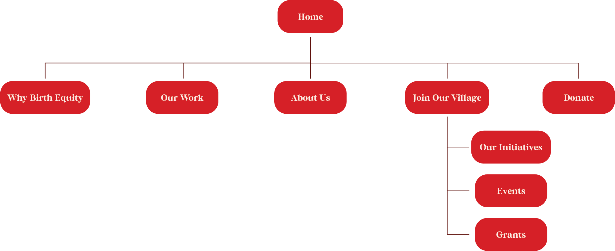
Because all three types of users have reached out to Mama Glow via their website, we used the website navigation as a jumping off point. I considered the best practices of what potential donors want to see in order to make a decision and considered what each user type would need to see to reach their goals:
IDEATE
I identified the information each user would need to make a decision and reach their goals to build our content strategy. We then got more specific about what each page had to say and how they interconnected with the rest of the site. I shared the content outline on a google doc where the client could add the final copy.
Hero Section
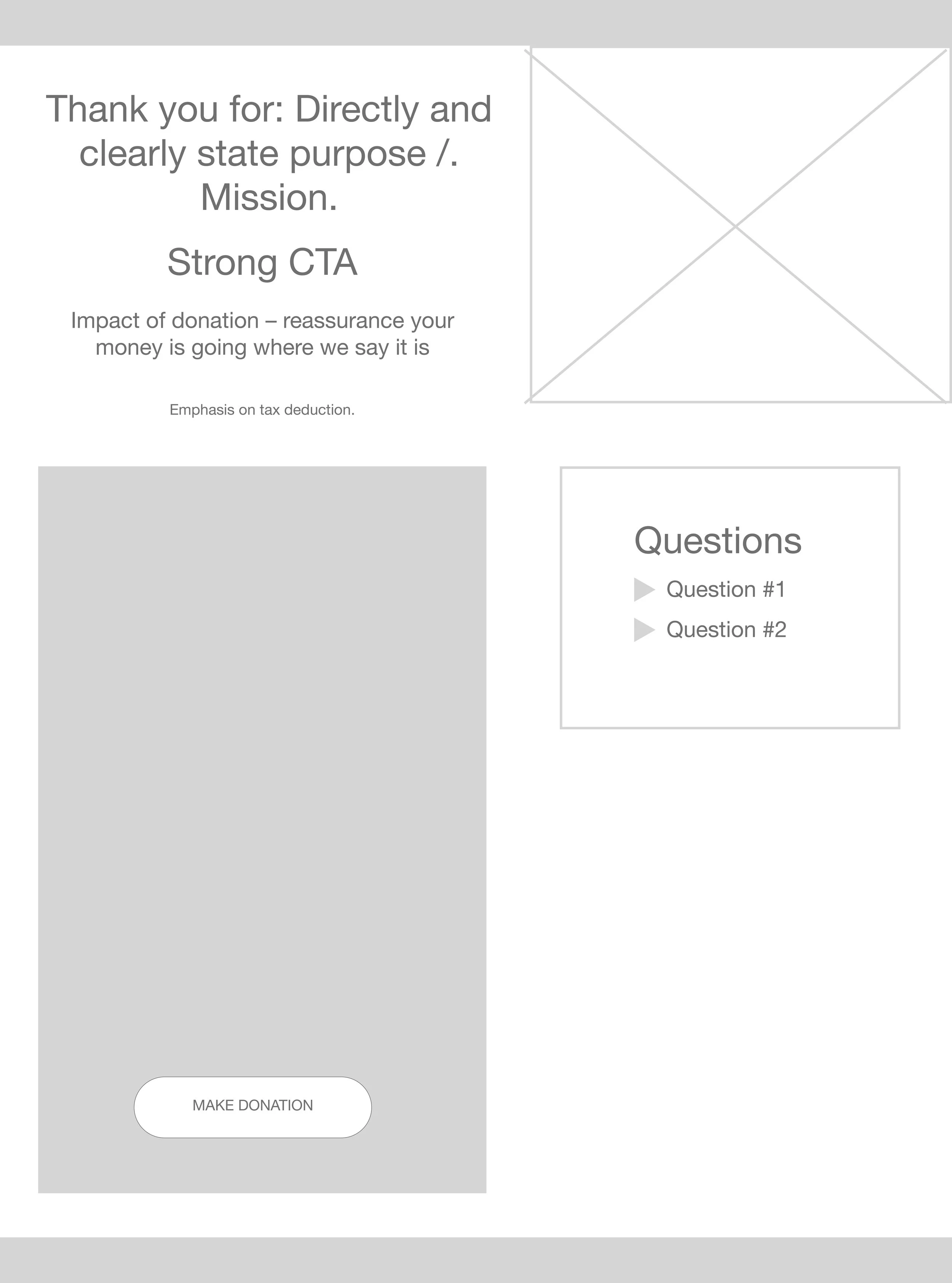
Donations Page
Supporting Pages
DESIGN
Low-fidelity Wireframes
Using recognized design patterns to showcase our content strategy, I started laying out our content in low-fi wireframes as the client delivered the content.
It was important for visitors to understand the Birth Equity issue and how it affects Black women’s lives. We expanded on how the foundation is addressing the issue as it comes to health, education, community, and economic empowerment.
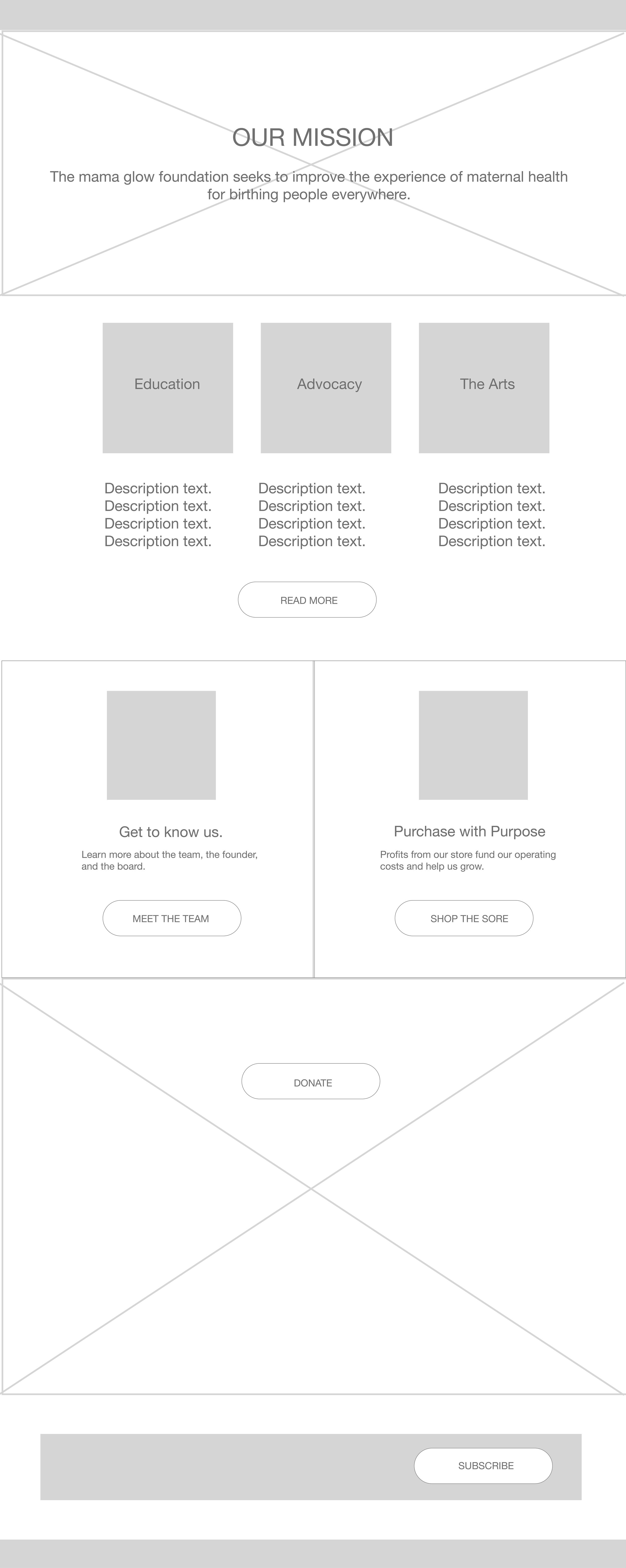
The homepage works as an introduction to the different pages available across the site. The focus was on immediately introducing the message, followed by videos of the community we serve to show impact.
Homepage
Why Birth Equity?
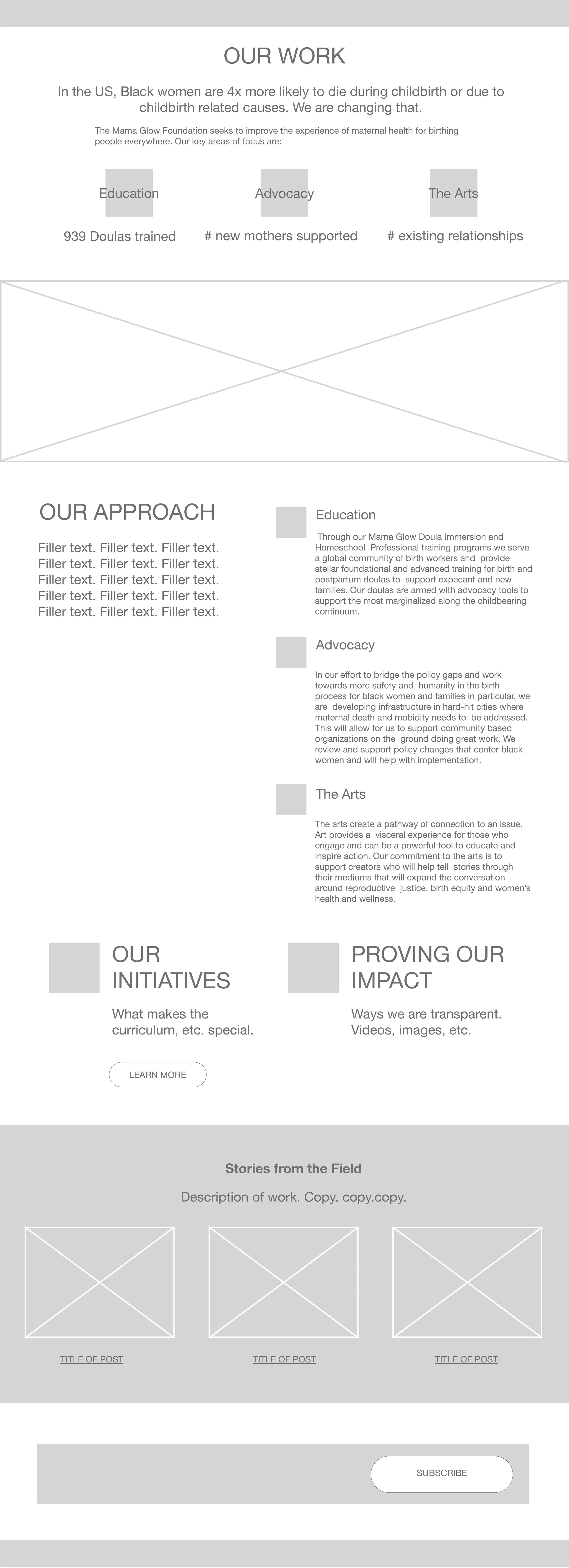
The foundation’s work focuses on three areas: Education, Advocacy, and the Arts. This page served as a landing page where focus areas and our partnerships would be showcased.
Our Work
About Us
We decided an Our Mission page would be redundant and it was more important to introduce the board and force behind the foundation.
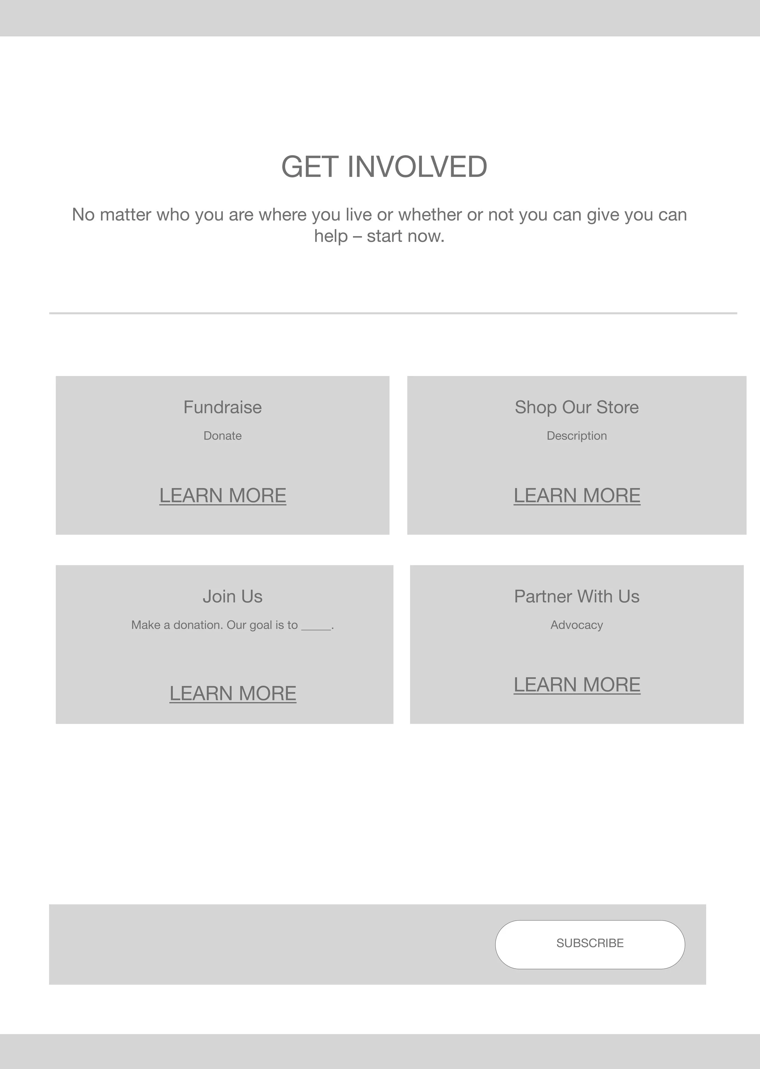
Join Us is a summary of the different ways one could get involved with the foundation: Fundraise, Shop for a Cause, Donate, or Partner with Us.
Join Our Village
Our Initiatives
We go into greater detail of the programs, partnerships, and outcomes in each focus area. We link to grant opportunities to funnel applicants.
The goal of the donation page was to make donations as fast and easy as possible. The multi-step donation form loads with a pre-selected amount and asks for the minimum amount of information possible.
Donate
Grants
To avoid erroneous applications, we clearly labeled grants by title and description and on the individual grant page, I include a like to an eligibility quiz.
Branding
I worked alongside Mama Glow’s branding team to come up with a creative direction for the site. The client wanted the website to feel like a “world onto itself” where users would feel fully immersed. The Creative Director proposed different geometric shapes “falling” along each page. They would also adorn images. These would present a challenge during the build.
High-fidelity Wireframes (selected)
With copy still coming in, we had to start finalizing the UI design to meet the deadline. We focused on mobile design first because of the space constraints and then moved onto desktop.
BUILD
The Challenge
I built the website on Wordpress using Elementor on a very tight schedule. We used GiveWP to accept donations.
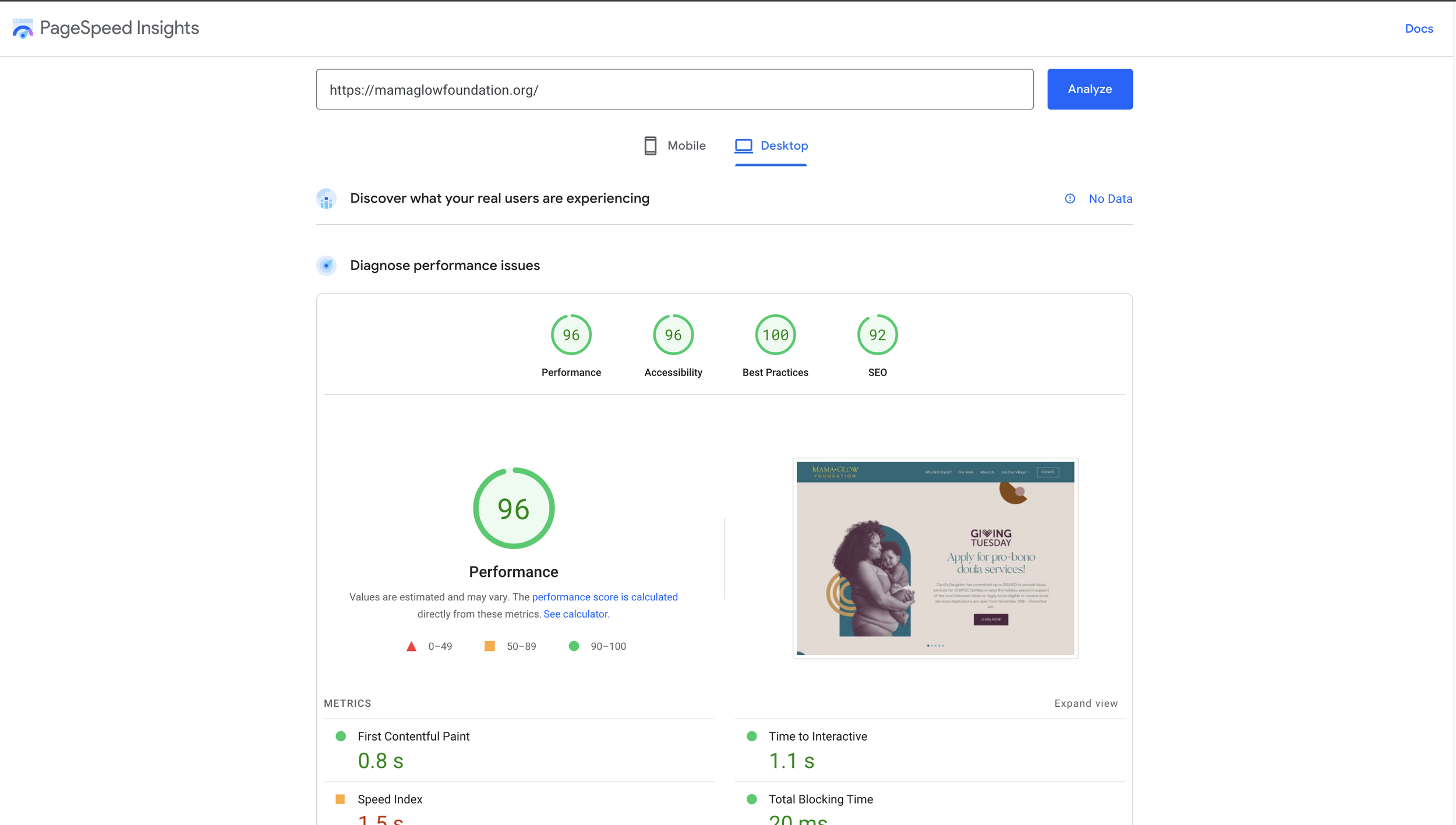
We failed to consider how incorporating individual shapes along the page would affect a website’s performance, specifically, loading time. The original conceit was that they might be animated, but we quickly had to let that idea go for the sake of performance.
Once I realized the consequences of the design, it was too late to change the design, but I was able to mitigate issues by:
Inserting shapes as background and foreground images for each section using normal positioning. This did alter the design slightly, but it was barely noticeable. This allowed for the shapes to load in the appropriate position with more consistency.
I used photoshop to combine images with adorning shapes and then uploaded it as a single image to save on load time.
Overall, load times are acceptable, especially considering the project’s short turn-around time, and I was able to faithfully translate 99% of the design.
Conclusions
We successfully designed a 9-page foundation website where individuals successfully make donations, institutions such as Goldman Sachs and Kate Spade have initiated partnerships, and where potential beneficiaries can contact us about our offerings.
We’ve since worked with Carol’s Daughter, a L’Oreal company, on the Love Delivered Initiative to raise awareness of the Black maternal health crisis. Our landing page has received 5K page views to date.
Next Steps
Next steps will be to continue developing our homepage and Our Work page to showcase our partnerships so we can continue to engage visitors and inspire donations. We are focusing on building a more flexible hero section and introducing banners along the site to point to the latest activities.


