MILKFLOUR
A breast milk freeze-drying service.
Figma Prototype - Custom Estimate Flow
CONTEXT
Background
Milkflour is an early-stage startup dedicated to making breast milk more accessible using freeze-drying technology. The initial ask was for a responsive website to introduce the company and manage transactions.
The founders ran a survey with 49 potential customers to validate their value proposition. The survey results pointed to market interest but also revealed 73% of respondents were unfamiliar with the concept of freeze-drying breast milk and the benefits of this service. We quickly realized we needed user research, design, and testing to learn how to position the brand and its services as trustworthy and indispensable.
After guiding the founders through multiple design iterations informed by 12 user interviews and user tests over 3 months, I delivered designs for a responsive website, native mobile app, and company branding designs to meet nursing mothers’ needs to understand and access this important service.
My Role
I was the sole designer on the project. I led user research, synthesized product strategy in partnership with founders, designed and iterated UI, designed branding assets, built prototypes, and conducted usability testing.
PROCESS & DELIVERABLES
User Interviews
Survey
Contextual Analysis
Competitive Analysis
Discovery Report
Personas
Empathy Maps
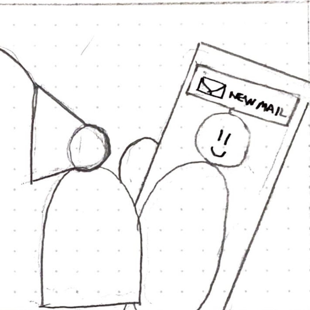
Storyboards
Card Sorting
Site Map
Customer Journey Map
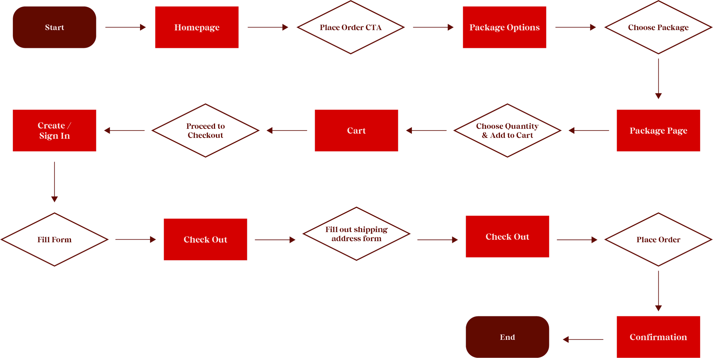
Task Flows
User Flows
Content Strategy
Sketches
Lo-fi Wireframes
Mood Board
Logo
Style Tile
Prototype
User Testing
Iteration
High Fidelity Wireframes
Conclusion & Next Steps
RESEARCH
Summary
Analysis & Interviews
I began my research with a comparative and competitive analysis. I interviewed 3 breastfeeding people and conducted 1 contextual interview where I observed a morning breastfeeding routine.
Discovery
Interviewees immediately saw the benefits of freeze-drying when it came to travel, storage space, and shelf life. The challenge most cited was the cost of service.
Opportunities
The opportunity lies in a native mobile app that provides around-the-clock customer service to match breastfeeding schedules, live breast milk tracking for peace of mind, and provides educational and supportive content in a hands-free audio format.
Contextual & Competitive Analysis
The Industry
When breastfeeding was discouraged, non-profit milk banks gathered, processed, and supplied breast milk primarily to hospitals. Once breastfeeding became popular again, informal online communities met the demand with cheaper and more convenient supply (due to the lack of overhead milk banks need to adhere to). Since then, private companies have emerged to meet specific needs such as traveling mothers who need to ship their supply home, or freeze-drying services for mothers who want to stock up.
Competitors
To scope my efforts, I looked at primary, secondary, and indirect competitors in the breast milk service space to determine strengths and weaknesses in their offerings. It allowed me to identify ways Milkflour can differentiate itself.
Circle #1 - Direct Competitors: Freeze-dry services
Circle #2 - Secondary Competitors: Shipping services, Milk Banks, Membership Sites, and Volunteer Coordination
Circle #3 - Indirect Competitors: Fortified Milk Products
User Interviews
Understanding the “cost” of breastfeeding
What most statistics about the hardships of breastfeeding often overlook are the logistics and emotions surrounding the feeding. Currently, less than half of all breastfeeding people make it to the recommended 6-month mark, and just a fifth stick with at least some breastfeeding for an entire year.
Nutrition
For those storing as well as feeding, a lot of effort goes into eating and drinking enough to produce the necessary amount of milk.
Sanitation
They also have to juggle milk sanitation and breast maintenance to prevent infection or clogging.
Stress
It also does not take into account the mental pain associated with insufficient sleep, loss of bodily autonomy and independence, as well as the physical pain when milk builds up in the breasts when the person is unable to pump or feed due to work, etc.
Discovery
Enter Freeze-Drying Services
Since 73% of those surveyed were unfamiliar with freeze-drying breast milk, it came as no surprise that none of the four breastfeeding people interviewed knew of the service. Once they understood the service, they were most excited about the following solutions:
Travel
Makes travel easier not only because of how relatively light and compact freeze-dried breast milk is, but also because there was no concern for keeping breast milk sufficiently cold.
Storage Space
Even for breastfeeding people who didn’t produce a lot of breast milk, the room it would take in the fridge was a nuisance. Breastfeeding people are known to own dedicated breast milk fridges when necessary.
Shelf-life
Interviewees mentioned that frozen breast milk was only good for a year. The 3-year shelf-life offered by freeze-drying was a “game changer”.
The Challenge
The challenge most cited regarding the service was its cost. Babies can drink up to 40oz a day (one interviewee’s baby drank 16oz at night alone). At an average of $2 an ounce, the cost was prohibitive to 3/4 interviewees. However, the interviewee who didn’t produce a lot of breast milk said she'd consider freeze-drying services if it enabled her to procure donated breast milk from within a trusted circle of friends.
Opportunities & Capabilities
Mobile Phones
Our opportunity lies in a native mobile app. All interviewees mentioned their cell phones during their breastfeeding process. Whether it was to text themselves how the feeding went for future reference, watch videos of their baby so they could produce milk at work, run errands at 3 am, or just take some time to themselves while they breastfed, the phone was a tool and an outlet for a breastfeeding person with access to only one of their hands.
Customer Service
Interviewees described white glove service as any service that takes the thinking or effort out of any particular task. With a native mobile app, we can consolidate tracking, customer service, and education. These are capabilities users are already used to and expect from other apps. Considering everything breastfeeding people already have to consider, we have a lot of pain points we can respond to.
Supportive Content
Interviewees cited apps whose value is delivering information (What to Expect, Solid Starts, etc.). If we include instructional videos regarding our service or coaching videos to help breastfeeding people with common challenges, it will encourage app use and foster trust in our brand. Because all interviewees cited mental strain as a challenge of breastfeeding, this could also be as simple as incorporating supportive prompts/inquiries like “How are you feeling about breastfeeding today?”.
Different Pick-up & Drop-off Locations
Currently, shipments focus between the user’s home and the freeze-dry facility. If we take breastfeeding people who work and travel into account, as well as those interested in donating freeze-dried breast milk (3/4 mentioned donations), we must give the option for a different delivery address from the point of origin. This shift will expand our user base.
Defining Our Users
I organized the interviewee’s responses and survey results into a series of behavioral and demographic variables. The most obvious patterns and differentiators were those with a:
DEFINE
Limited Supply
One interviewee didn’t produce enough milk but knew a lot of friends who were producing a surplus. With dry-freezing services, it would have been easier to set up a milk-sharing system and network between friends.
Surplus Supply
One interviewee produced so much milk she was afraid it would go to waste and considered donating it to a milk bank. With a prolonged shelf life, she’d have more time to donate surplus breast milk or save milk to incorporate into solid food or for her second child.
Build a Stash
One interviewee is planning on breastfeeding for up to two years and felt more comfortable with a more shelf-stable stash, especially in case of emergency. Not having to worry about temperature control would also make travel either for vacation or commuting to work much easier.
Building Empathy
Empathy Maps
I decided to cross-reference supply issues with life constraints and further define user profiles by incorporating insights from interviews into empathy maps. This deepened my understanding of the key differences and needs of each user.
Personas
Though both users cared about their children’s nutrition, differences in career choices, resources, and the specific pain points regarding breastfeeding, lead to unique personas.
Gender: Female
Age: 37
Location: Miami
Status: Married
Work: Developer
Jessica Miller
“I wasn't being very analytical about it. It was like ‘today I got more or less than yesterday' kind of thing. I would have noticed anyway just by the amount in the bag."
Jessica chose to breastfeed because she wanted to bond with her baby and for breast milk’s nutritional value. A lactation specialist at the hospital gave her instructions, but it was such a heavy time to process information that Jessica felt anxious about breastfeeding once she was home. Luckily, her mother was able to give her tips on angles and mouth positions which made breastfeeding less stressful.
The biggest challenge was exhaustion. Each feeding and pumping session came with a long list of tasks. Once the baby was fed and put down, Jessica had to pump in order to build a stash. She then had to label and store the breast milk, sanitize the pump and the used bottle, log how the session went, treat her nipples to prevent clogging, and be ready to do it all over again in less than 3 hours before her breasts began to ache again.
She was able to build a large stash that took up so much room in the refrigerator that they bought a separate dedicated fridge. She didn’t want it to go to waste so she called a milk bank to see how long milk could be frozen before being donated. She’s planning on having more children but doesn’t know if it’ll be in time to use the breast milk she’s already pumped.
Even though her body acclimated to being tired, Jessica still found nights difficult, especially when she saw her husband Michael sleeping through the night. To keep herself up, she’d do some shopping on amazon at 3 am. She also used her phone to text herself at what time the baby finished eating and from what side so she’d know where to start at the next feeding.
Eventually, Jessica had to return to work, but luckily she works from home. Scheduling feeding and pumping around meetings and deadlines made things more complicated. Even though she could have positioned herself out of sight, Jessica didn’t feel comfortable pumping during meetings which could have helped her save some time. Despite these challenges, she knows it would have been more of a hassle if she had to do it from an office.
Persona Bio
Make sure she’s breastfeeding properly so she can bond with her baby.
Pump enough milk to not be soley responsible for feeding the baby.
Make sure her breast milk stash doesn’t go to waste.
Goals
Works 40 hours a week with a very flexible schedule
She doesn’t do too much research for purchasing purposes
Isn’t thorough with her record keeping
Behaviors
Traveling with frozen milk is difficult. TSA ruined a batch on her way back home.
How much room her breast milk takes up in the fridge
Gets anxious when she doesn’t know if she’s doing something right or not
Brands
Frustrations
Qeepsake
Amazon
The Wonder Weeks
Gender: Female
Age: 32
Location: L.A.
Status: Domestic Partner
Work: Costume Designer
Amanda Johnson
“It's stressful if you have too much, it's stressful if you don't have enough it's probably just as stressful if you have the right amount too."
Amanda is as ambitious about her family life as she is for her costume design career. She was planning and saving to have a child for years when she finally got pregnant. She wanted to provide the baby with as much nutrition as possible by breastfeeding for the 6 months before she had to return to work.
The baby turned out to have a voracious appetite. Feedings took ten minutes per breast, but Amanda struggled to fit eating and drinking enough in the two hours between feedings to keep producing enough milk. Amanda’s body tried to keep up, but she started seeing a decline in her supply within the first month, very early on in her breastfeeding plan.
It was especially frustrating because her friends produced so much breast milk, they freezed it and donated it to hospitals. Unfortunately, her friends lived out of state so breast milk swapping wasn’t an option. Amanda had to start supplementing the baby’s diet with formula because she could only produce half of what he needed to eat.
Bottle feeding made it possible for Amanda’s husband and the nanny to contribute to feedings, allowing Amanda time to eat, drink, and sleep enough to keep producing what milk she could. Logging information became more important. They tried using an app to track of the last time the baby ate, from what breast, the start and end time of feeding, how much the baby pooped or peed, when he fell asleep and woke up, etc. but the app didn’t sync across devices so Amanda, her husband, and the nanny kept the log in a notebook.
Amanda wanted her baby to benefit from the nutritional value in breast milk, even if it wasn’t a large part of his diet so when she returned to work, she decided to keep pumping. The movie set she was working on did not provide the privacy and sanitary conditions necessary for long-term pumping. She also learned that pumping away from the baby was very difficult. At first, she only had to think of the baby to produce milk, but eventually she had to start looking at pictures, and then videos. Eventually, she had a folder on her phone jokingly called the “spank bank” to get her at-work pumping going. Pumping could take 30 to 40 minutes. Regardless, she was glad she was able to provide breast milk to her baby as much as she could.
Persona Bio
Works 60 hours a week and brings work home with her
Once she’s decided she wants something, she doesn’t care how much it costs or how it gets done
Better at taking care of other rather than herself
Behaviors
Goals
Make sure every drop she can pump makes it to her baby
Feed the baby brreastmilk for as long as she can
Pump at work for as long as she can
Not producing enough breast milk for her baby
Lack of pumping support at work
Amount she has to eat and drink to keep producing milk
Willow
Apple
Baby Tracker
Brands
Frustrations
Storyboards
Making Room for Multi-tasking
For each user, I chose a moment in which many of our user’s frustrations accumulate to motivate them to consider Milkflour’s services.
I balanced showing what the app could do with the user in their context. I added challenges throughout the narrative to keep the focus on the user's world.
One insight is if the users are always in the middle of something and they're exhausted, we have to consider making videos so users can listen to our value proposition while they work instead of just relying on text.
Persona: Jessica Miller Scenario: Shelf-life of large supply
While pumping, Jessica starts to wonder if her baby will get through all the breast milk she’s storing or if it’ll still be good for the second baby they’re planning for. She googles “long-term breast milk storage”.
Jessica is breastfeeding at 3am. Once she puts the baby down, she’ll have to pump in order to keep her milk flow up. Jessica is exhausted.
The app walks Jessica through every step of the freeze-drying process, reassuring her how her breast milk can conveniently be shipped, assigned a unique serial #, processed in a laboratory setting, and shipped directly to her front door.
She comes across an article on freeze-drying breast milk and learns it has a shelf-life of 3-years. She comes across Milkflour and decides to download the app.
A series of testimonials spoke to the excellent customer service, the 24/7 tracking capabilities, and the notifications and reminders that will make sure you’re always on the same page. Jessica decides it’s a good investment.
The app also walks her through the shipping process: once she schedules a pick up, she’ll be sent a pre-paid temperature controlled box where she can pack her breast milk to be picked up.
Jessica schedules her first pick-up after setting up a profile and adding her credit card. She starts fantasizing about getting rid of the breast-milk dedicated fridge in the garage, and how easy travel was going to be.
Jessica puts her phone down and relaxes knowing no matter how much she produces and what her future family plans might be, her breast milk won’t go to waste.
Persona: Amanda Johnson Scenario: Supplement low-Supply
Halfway through her 20min pumping session, she can already tell she’s producing less than she hoped. She felt the shame and anxiety building when she got an email notification from her friend Nicole.
After kicking the costume department out of the trailer, Amanda tries to pump as much as she can while looking at pictures and videos of her son to trigger milk production.
Nicole produces more milk than she needs and knows Amanda is having a hard time. Nicole forwarded a link to a breast milk freeze-drying service that can pick up Nicole’s frozen breast milk in N.J. and deliver it freeze-dried to Amanda in L.A.
Amanda considered participating in a local milk swap, but didn’t feel comfortable accepting milk from strangers. She was curious to learn more about a service that would allow her to work together with a trusted friend.
As Amanda labeled and stored what she was able to pump, a knock came at the door. The pumping session lasted longer than usual and the team had to get back to work. Amanda calls out she needs five more minutes to clean up.
As she cleans up, she learns that the app provides 24/7 tracking and a comprehensive log anyone logged into the account can access. She’ll always know when to and how much milk to expect in real-time.
Amanda finds out her friend already scheduled the first delivery and it was coming that week. With a shelf-life of up to 3 years, Amanda will be able to supplement her baby’s diet enough his voracious appetite.
Amanda leaves the trailer and calls her friend to thank her for finding the service and for donating her milk.
Information Architecture
“If it takes more than 15-minutes to learn what I need to learn, make a decision, and then execute, it’s not happening.” – M
In regards to information architecture, I hypothesized the primary challenge was to make sure users can quickly understand what freeze-drying is as a process versus a service. User attention spans are short and the stakes are too high for a delay in educating and therefore reassuring users are in the right place.
Card Sorting
Because freeze-drying breast milk is such a new space, I wanted to understand how users interpreted existing navigation. The cards were then the result of analyzing our competitor's navigation and keywords from user interviews.
Two of the people we interviewed sorted cards independently and without parent-level cards because they were familiar with the service. The three participants who were not familiar with the project sorted cards with parent-level cards while on Zoom.
I consolidated card sorting results into a spreadsheet to see where there was a major overlap. I cross-referenced the cards I provided with user-assigned card categories and ultimately organized them into the most popular categories.
Site Map
The result is a straightforward high-level sitemap conceived to guide users of different comfort levels to their most pressing questions. The lower-level categories were further refined as I worked on task and user flows.
IDEATE
Task Flow Chart
Deciding on the main task made me pause. Is the first step educating the user? If so, wouldn’t the main task be leading the user to the right information? Ultimately, however, the main business goal is to have users sign up for the service. So I decided to start by exploring how a user could place an order.
Because stakeholders are still coming up with their processes, it was an opportunity to see how UX can affect business systems and vice-versa. I executed a competitive analysis of current competitor processes to find gaps in efficiency and identify opportunities for an app to replace less efficient processes.
I cross-referenced what I learned from our competitors with Amazon's shopping and check-out process. I wanted to make sure the process was as lean as possible.
Customer Journey Map
Unless the user comes in prepared, which is not likely because we’ve found most breastfeeding people are not aware of the service, it’s unlikely that they’ll be coming to the website to make an immediate purchase. The card sort also shows information is of primary importance, followed by price.
I had to determine how much of the user’s journey occurs on a landing page vs. a mobile app so I took a step back and created a Customer Journey Map up until the point the user downloads the app. The rest of the journey will be reflected in the User Flow.
User Flow Chart
The flow chart begins after the user spends the Awareness, Consideration, and Validation stages of their customer journey on Milkflour’s responsive website.
From there, the user downloads the app, sets up an account, and then has three ways to interact with the chat box:
Click on suggested articles under “FAQ”
Click on “Place Order” CTA
Click on “Start another conversation”
Content Strategy
Milkflour’s responsive homepage will most likely be our first touch point with users. These low-fi wireframe sketches helped me consider layouts for what users want to see first (based on the card sort) while addressing their goals and concerns (based on interviews).
I took into consideration that because breastfeeding people are usually multitasking, videos would be important for users to listen to.
Also, since transparency is so important, tours and infographics would allow me to deliver a lot of information simply.
Each version prioritizes different information delivered in alternative formats - slider, extended section, video, etc. This helped me narrow down the possibilities for what should show up on the mobile app.
Lo-fi Wireframes
Our main goal was for users to place an order, which meant educating the user as efficiently as possible while engendering trust via testimonials. The lo-fi wireframes allowed me to flesh out content details which determined the order of sections. I also explored incorporating a CTA to download the app as a jumping-off point for the user.
The Native Mobile App
Sketches
Our research revealed two main opportunities: a mobile experience and white glove customer service. Picking up from where we left off the customer journey, our user downloaded the app to make a purchase.
The main workflow these sketches explored was how our users can get an estimate via the chat box and add the package to their cart. I worked on three approaches:
estimate calculator on the app homepage
estimate calculator on chat box pop-up
estimate via chat
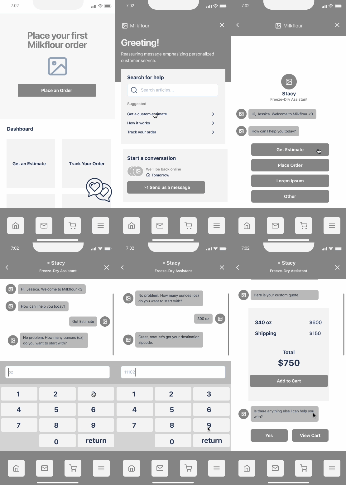
Lo-fidelity Wireframes
I wanted to reuse as much of the UI as possible whether it was on the homepage or in the chat box environment. However, for the user going through a conversation, I broke up the estimate into multiple choice instead of a visual dial to give us a chance to guide the user and build trust via the “conversation”.
When user clicks on chat box icon, chat box main menu appears.
App main menu.
If the user decides to chat, they can start a conversation by clicking on “send us a message”. The bot will begin the conversation.
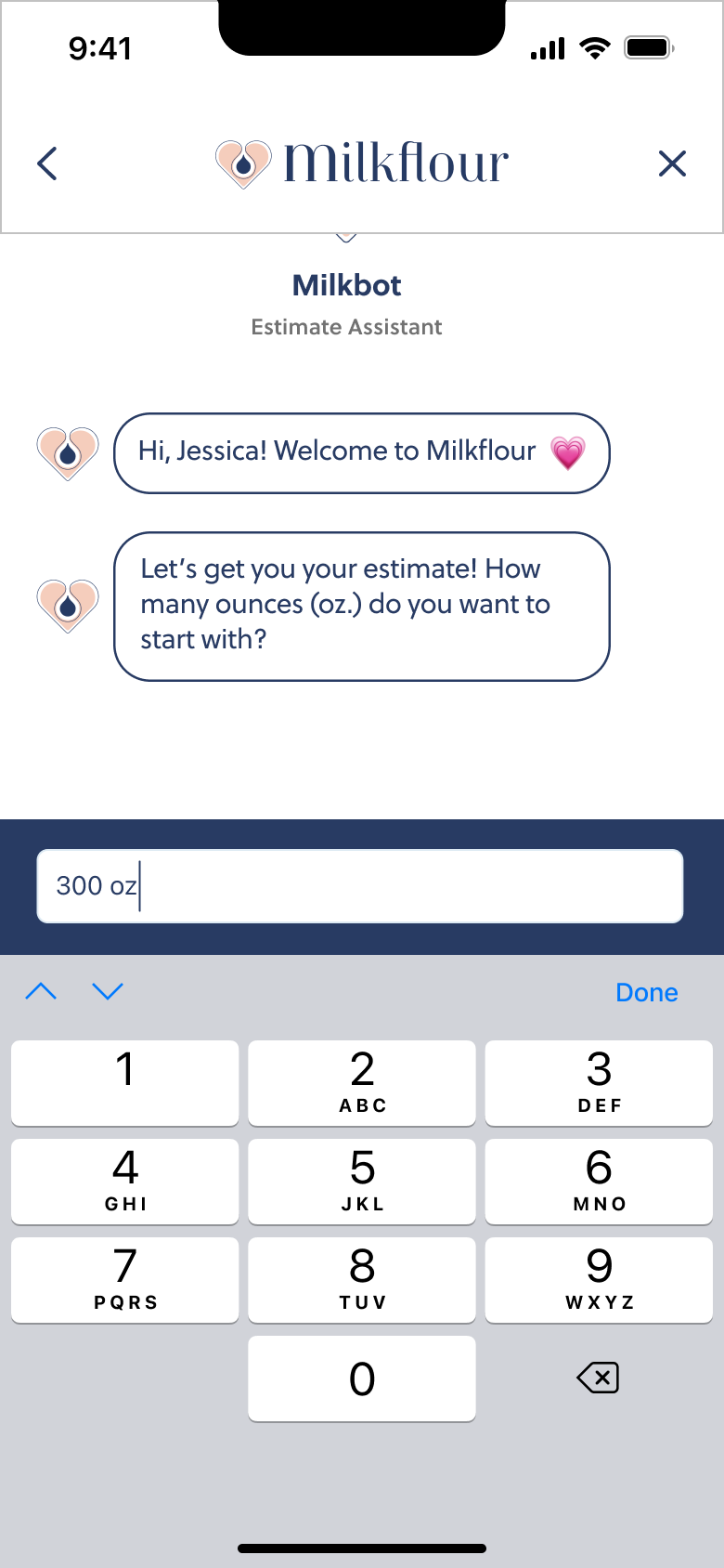
The bot will guide the user through the estimate.
Once amount is chosen, the chat bot will inquire about the delivery zip code.
The dots in the text box will animate to show next page is loading.
If amount is custom, a modal will appear with a dial for the user to manipulate.
An estimate reflecting the amount and zip code will load in the chat with a CTA to “add to cart”.
The number keyboard will appear with a blinking input cursor to prompt the user.
After a lag, the chat bot will follow up to see if the user needs more help.
Brand & Identity
Mood Board
After brainstorming with stakeholders and doing word association exercises, I proposed “Milkflour” as the name of the company. It was important for the name to communicate the process from liquid to solid as well as refer to the final product.
Logo
Due to the sensitivity of handing over breast milk to a third party, I wanted the logo to immediately communicate that Milkflour understands all of the love and effort behind expelling each drop.
Brand Style Tile
I chose a soothing, but playful pastel color palette anchored by a navy blue to inspire trust. I created a set of icons that communicate the unique services Milkflour offers. Images are used as pops of color and dimension. I chose Soleil as the main typeface to keep things simple and legible.
Colors
Icons
Images
Typeface
Objective
The objective was to test the mobile app purchasing flow, specifically after providing an estimate via the chat box. I used a low-fi wireframe prototype on Figma. We tested the prototype on both the iPhone and Google Pixel with 3 birthing people familiar with the project. Success is the participant placing an order through the app.
TESTING
Process
I communicated with test participants via Zoom while simultaneously screen-recording them navigating the prototype on Figma’s mobile app. At the beginning of the testing session, I presented the following task & scenario:
Task: Jessica wants to get an estimate of her first freeze-drying order before deciding to purchase.
Story: You’re pumping at 3 am. You start worrying your baby won't get through all the breast milk you’ve stored before it expires. You google “long-term breast milk storage” and come across a MilkFlour blog post about how freeze-dried breast milk has a 3-year shelf life! After watching a few videos on the homepage, you decide to download the app to check it out. You finally decide to get an estimate using the chat box. What would you do to get an estimate using the chat box?
Findings
All three users were able to complete both tasks: get an estimate using the chat box and checking out. I summarized pain points, wins and suggestions.
Pain points
Chat box doesn’t immediately read like chat box
Didn’t notice “save for later” button during check out process
Custom option made user nervous
Specifying card type was confusing
User wouldn’t check out without an ETA
Negative associations with search fields
“Get Estimate” on homepage diverted users from chat box
“Proceed to checkout” button not prominent enough
Chat box icon confusing b/c it has two icons without background
Didn’t notice shipping price on estimate and had to wait until checkout
Wins
Chat box had clear options and always the options needed
Considered “Straightforward”
Suggestions
Add background to chat icon so it reads unified
Add shipping ETA earlier in process
Priorities
Make initial chat box screen read more like chat box
Improve chat box icon for clarity
Add shopping ETA sooner in process - will help them make decision
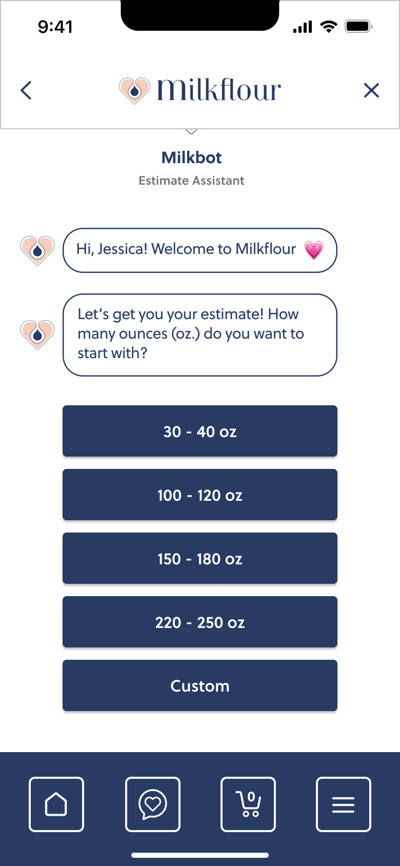
Hi-fi Wireframes
Responsive Landing Page
Native Mobile App
Conclusions
It was a challenge entering an emerging market offering such a highly-sensitive service. It was difficult to narrow down the pain points we could alleviate for our users. Keeping business goals and constraints in mind, allowed me to narrow in on our competitive advantage: white-glove customer service in native mobile app form.
With few competitors in the market, there was an opportunity to determine solutions from other services users are used to such as chat box capabilities. Deciding when to explain the process vs. the service while guiding users to consider the service was also a challenge.
The next steps are to calibrate an MVP based on what we've learned and our ultimate goal of a native mobile app to Milkflour's timeline with their facility and team build-out.


